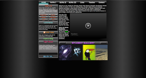
I have been coding websites for about 6 years. My fist site, seen at the top of the column, was made as part of an ed tech class I was taking for my master's degree program. It served the prupose at the time. But there were a lot of things in it that were superfluous, but necessary to get a grade in the class. But, I needed a website for my class, so I decided to kill two birds with one stone. The layout was done using tables. And there are a lot of buttons just because I wanted to learn to make buttons. One of the main purposes of the website was to display video tutorials and lessons for my 3d modeling and game design classes, as well as to display students' work.
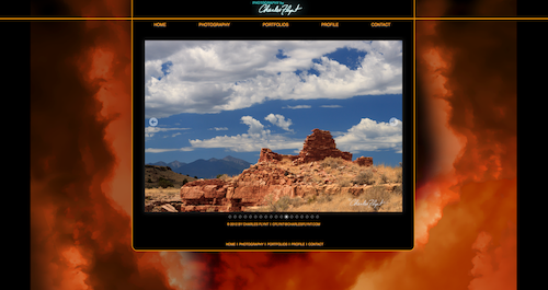
As I got more into web coding, I discovered CSS. I was also getting more into photography at this time, so I need a portfolio webiste. So, the second interation of my site was a portfolio site. The goal with this site was to use all CSS to format it and keep the code simple and clean. The color scheme came from a series of photos that I had done on a trip out to Nevada, Utah and Arizona. I was also trying to make it somewhat unique among many of the other photography websites I had seen.
The final iteration of my site rolls both personal porfolio and classroom into one site. The goal was to update the design to make it more clean and modern and, more imnportantly, to make the site responsive across all devices and screen widths. I used a grid layout stylesheet and media queries to make the site resposive. I also added some CSS animations, since animation is part of what I teach.

The home page from my old teacher website.

The homepage from my old personal wesbsite.